Let’s imagine that we’re about halfway through our enrollment process. Now, think about some of the questions we may be asking ourselves:
- Are there enough total applicants to meet our enrollment target?
- Do we need to admit more students to increase our chances of securing more deposits?
- What programs could help specific prospects transition through the funnel towards enrollment?
These are difficult questions to answer. Intuitively, we might consider looking at historical trends from previous years to compare against where we stand today. But how do we know if all of the conditions that led to our prior results are still applicable now? And do we have enough confidence in high-level historical trends to communicate expectations to our key stakeholders about what will happen this year?
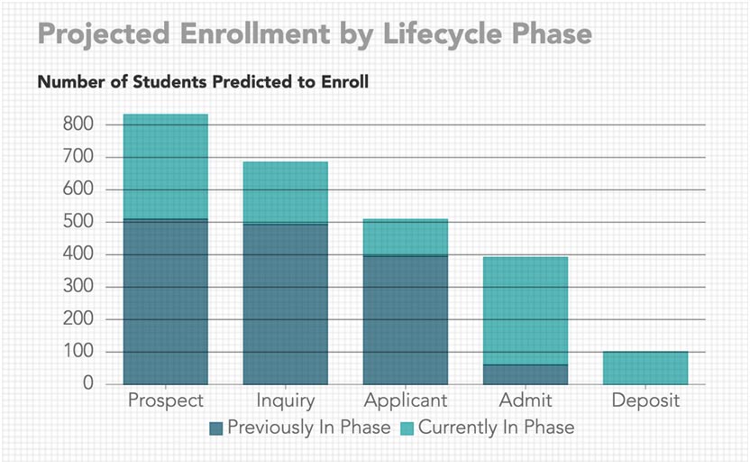
With these questions in mind, Othot is excited to announce a new visualization: Projected Enrollment by Lifecycle Phase.
This visualization can be used to quickly determine if the funnel has enough prospects at each lifecycle stage to meet an overall enrollment goal. Each bar represents the expected enrollment at each phase in the lifecycle, with color-coded regions representing the contribution from individuals currently in and those previously in each phase.
The ideal scenario is for each of the bars in the chart to exceed the total expected enrollment goal. This would represent high certainty throughout the lifecycle that an organization will ultimately meet or exceed its goal.
Each bar won’t initially meet the target enrollment goal because getting individuals through the funnel takes time and may be seasonally dependent. To meet a goal, there are two ways to increase the size of each bar: either increase the quantity of individuals in a phase or increase the quality of individuals in a phase.
On the flip side, whenever a bar in the lifecycle has reached the enrollment target, it could be time to focus efforts on programs or activities that will help those prospects transition to the next stage. For example, if the number of students in the Admitted bar has met the target, it may be time to place more of an emphasis on financial aid offers or invitations to programs that would likely increase the Deposits bar towards the enrollment target.
This new visualization, along with Othot’s What-if, Sensitivity, and Optimize functionality, present a more sophisticated and informed way to project an institution’s ability to meet its total enrollment goal than expecting history to repeat itself.
To learn more about this new visualization or if you have any questions, please contact me at jbmorgan@othot.com or schedule a short 30-minute demo.